Overview
Ninety Eight is a blockchain technology company that provides Web3 products and solutions. Its flagship and strategic product (Super Wallet) was launched in 2019. I joined the company in 2023, where my primary role involves enhancing existing features to improve usability and deliver a more user-friendly experience.
The Dapp Browser is where users frequently access decentralized services, participate in games, or join reward campaigns. It showcases a wide range of decentralized applications (Dapps) across multiple networks and categories, allowing users to interact with them by connecting their wallets. Essentially, it serves as a gateway to the Web3 ecosystem and plays a crucial role in the blockchain industry.
Feedback from stakeholders and users indicates that this interface lacks essential user experiences and has an ineffective information architecture. As a product designer, I collaborated with a UX researcher and other stakeholders to identify the core issues and develop effective solutions to improve the experience.
Objectives
Identify the core issues that cause user frustration on this screen, including those we may not be aware of.
Define specific metrics to measure the effectiveness of the design, including: the total percentage of time users spend actively on this feature compared to other features, the average time each user spends on this page, and the percentage of engagement across different segments within the same page.
Test different design solutions to determine the most optimal approach for enhancing the user experience.


Discover & Define
To pinpoint the current issues with the Dapp Browser and uncover their root causes, the team conducted three independent research studies, including:
User Interview (View Details)
Exploring user behaviors and gathering insights directly from users to better understand their needs and pain points.
Identify the personas of users who frequently engage with the DApp Browser, including their basic information, behaviors, habits, and usage purposes.
Gather user feedback and evaluations regarding the Dapp Browser feature.
Collect user suggestions and recommendations for improvements.
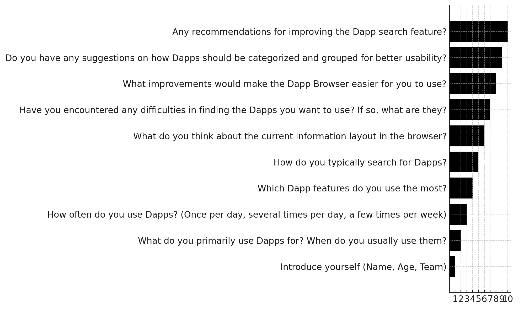
User Segment:

Discussion Guide:
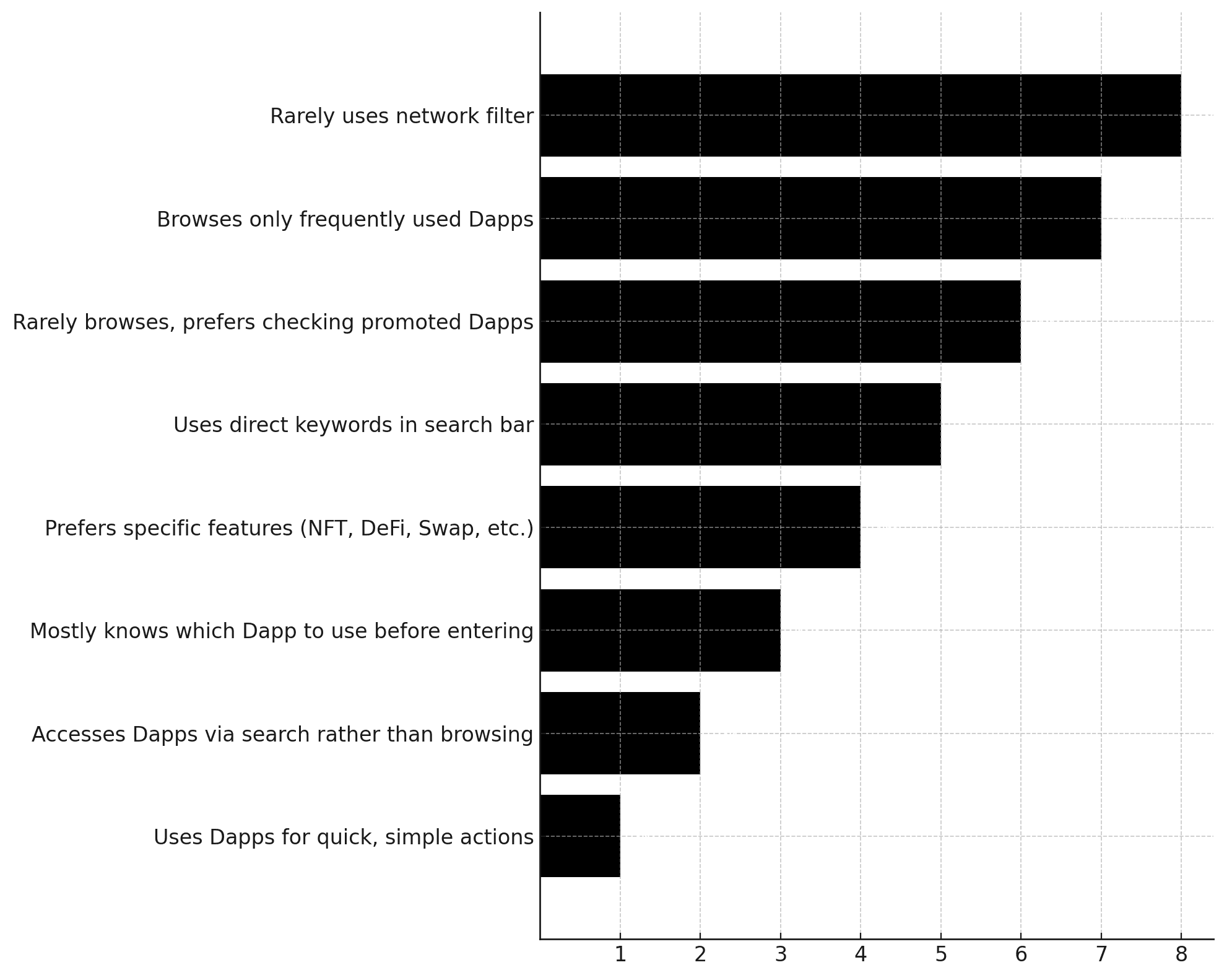
User Behaviors:
Feedback:

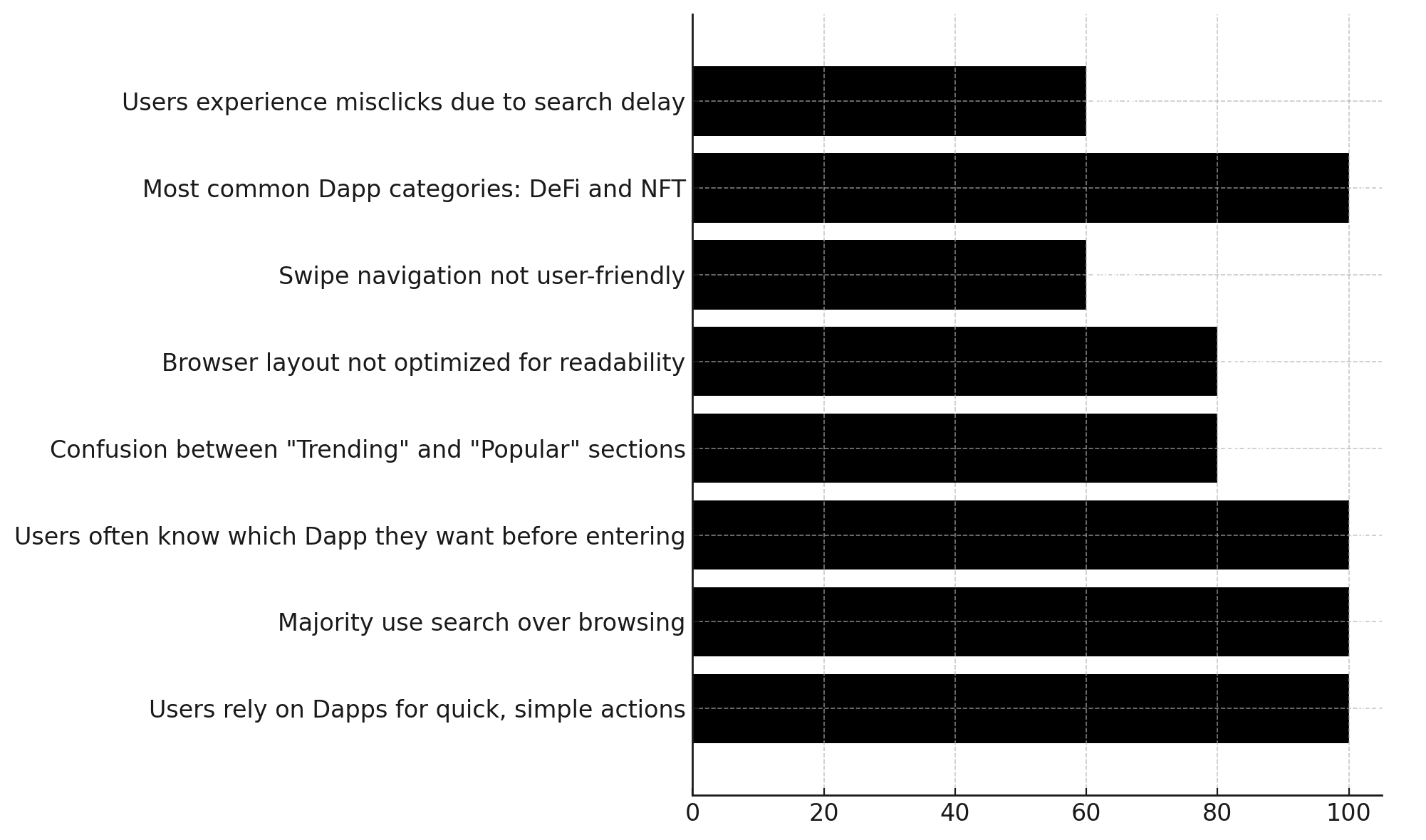
Insights:
Heuristic Evaluation (View Details)
Leveraging the expertise and experience of Product Designers to measure the usability of user interfaces in independent walkthroughs and report issues.
Evaluate the entire interface and user flow to identify both major and minor usability issues in the design.
Determine the impact level of these issues and propose solutions for UX and UI improvements.
Ensure the interface is intuitive and user-friendly.
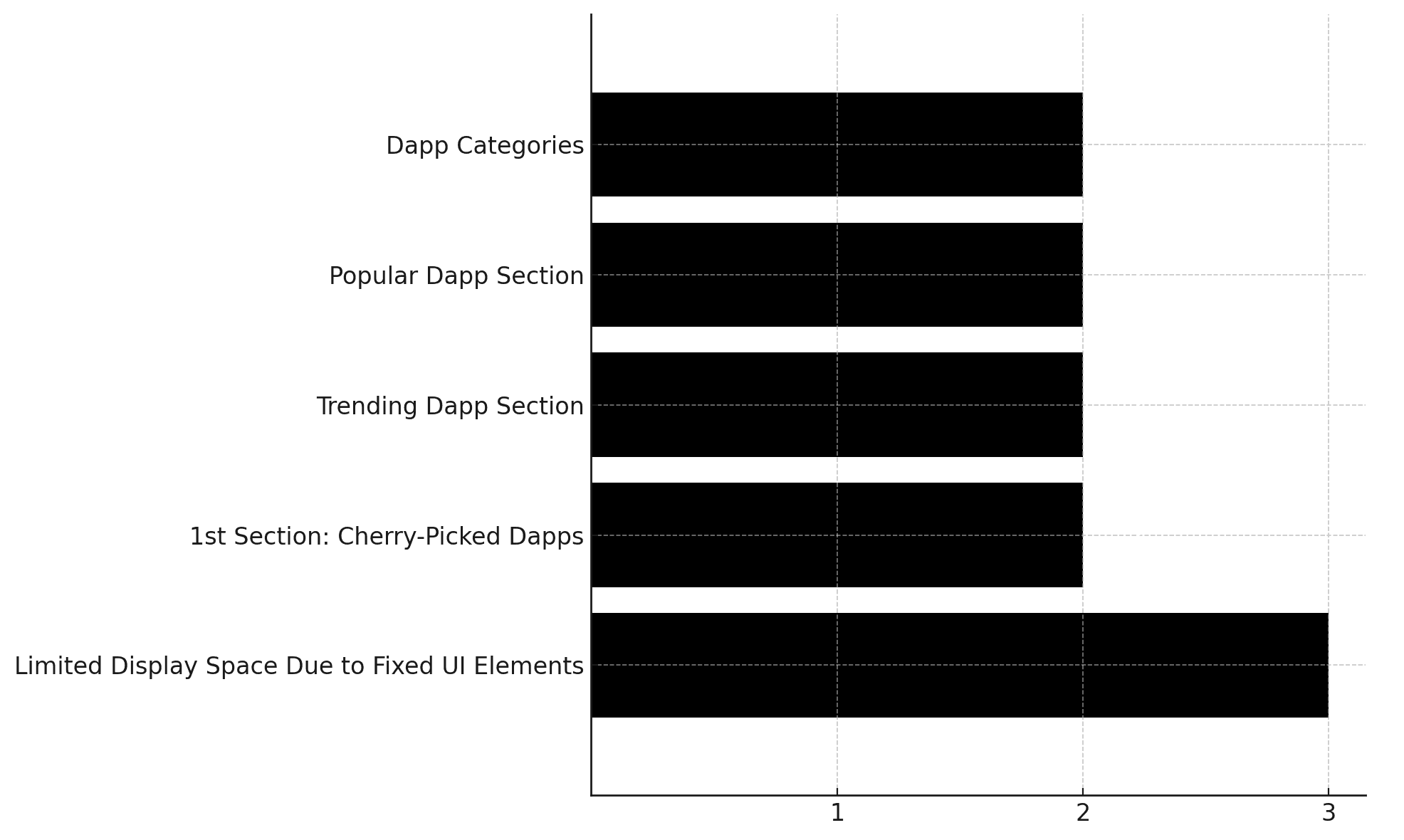
Issue Severity:
Competitor Analysis (View Details)
Examining how similar products implement the Dapp Browser feature to identify opportunities for enhancement.
Understand what competitors are doing well and where they fall short to find opportunities for improvement and differentiation.
Analyze competitors' strategies to identify emerging trends, user expectations, and successful design patterns.
Use insights from competitors to refine product positioning, optimize features, and create a more compelling user experience.
Approaches:

Key Insights
Users primarily access DApps through the Search function, as they already have a clear purpose and intent before opening the DApp Browser.
The app lacks personalized customization and tailored recommendations for relevant DApps based on user needs or those that the Growth team aims to promote.
The layout and information structure of the DApp Browser are not optimized, with overlapping sections that serve similar purposes and lack clear distinctions (e.g., Popular vs. Trending).
Recommendations:

Develop & Deliver
Based on the key insights above, the team conducted brainstorming sessions, created wireframes, mapped user flows, performed A/B testing, and developed a concept for the DApp Browser to validate the solution. The concept includes the following key components:
Home Browser
The content is divided into the following main sections:
Hero Slider: A customizable area to highlight Dapps with a specific purpose.
Featured Zone: Displays prioritized Dapp sections such as:
Popular: Trending Dapps that are widely used.
C98 Picks: Dapps promoted by the Biz Ops and Ops teams, serving business needs.
Favorites: Dapps saved by the user.
Note: The number of sections in the Featured Zone doesn’t necessarily have to be exactly three. It can be adjusted based on business needs.
Fixed Zone: Displays Dapp categories as defined.
Dapp Data Allocation:
Hero Banner on Home Screen as Card Carousel
Favorites on Home Screen as List Item
Our Picks / Popular on Home Screen as List Item
Recents on Search Screen as Shortcut


Search Zone
Add Focus State for the Search Page to:
Improve user focus on their search needs, reducing distractions from home page items as seen in the current version.
Display a Favorites list for users to quickly access their favorite Dapps.
Show a Recent list of Dapps the user has visited recently, enabling quicker access.
Adjust Primary Button on the Keyboard:
If the user types a domain name (identified by a dot), the CTA should be "GO."
If the user types without a domain, the CTA should be "Search" → Action: perform a Google search for the keyword.


When users tap the search bar, a focus mode will be triggered, with the space used to display the Favorites and Recent lists.

Recent items will display category text so users can easily identify the type of Dapp, instead of a description.

The search mechanism will list results based on the keywords entered by the user.

Optimize the result items (focusing on the name and category of the Dapp). Since users already have a purpose and knowledge of the Dapp when they search, by default, when users input keywords, the CTA will be "Search," directing users to a Google search page.

When users type a complete domain address, the CTA will switch to "Go," directing users to a website instead of opening a Google search.
Filter Zone
Increase the content browsing area.
Address the issue of users having to scroll through many network items to find a specific network in a narrow filter space (horizontal scrolling menu).
Improve user interaction with the network filter (e.g., the current network filter doesn’t have a "Multi-Chain" option, so after selecting a network, users have to tap twice to return to "Multi-Chain").
Define the priority and need for changing networks on this screen — is it really valuable?
Reorganize the Category filter menu: All, DeFi, NFT, Launchpad, Game, Others.


Dapp Item
Restructure the elements of:
Logo / Name
Description: Brief information (max 2 lines)
Supported Networks: Display up to 7 items, followed by [N+]
Badge: (New, Hot, Airdrop, High Yield)


Validating
We prepared mobile prototypes to test with users by creating specific scenarios for them to interact with and evaluate the effectiveness of the design:
Explore and navigate the homepage. Do you think the current categories meet diverse user needs? Were you able to find the category that interests you? If you could rearrange the categories, which section would you modify?
4 out of 5 users found the current information structure transparent enough to keep them engaged and encourage scrolling to read more details. The content and visuals are now clearer, making interactive elements easily recognizable.
3 out of 5 users felt that the prioritization of categories effectively highlighted trending applications, allowing them to stay updated with market trends quickly.
1 out of 5 users suggested that the Favorites section could be hidden if they hadn’t saved any apps yet, to optimize screen space and maintain a seamless reading experience.
Search for an application you frequently use. Did you find the search flow difficult to navigate? If you wanted to save frequently used applications, what would be your next step? Do you think having a saved app section would significantly reduce your search time?
Most users were able to search for and save frequently used applications with ease for faster future access. One insightful observation from a user was that they often paste an app’s URL into the search bar rather than typing it manually—as they usually find and copy links from social media rather than remembering app names.
What was your first impression of this page? Was there anything that caught your attention and made you pause? Do you find the provided details about an application sufficient to understand it at a glance? If you could add one or more pieces of information, what would they be?
All users (5/5) agreed that labels indicating an app’s status (e.g., trending, profitable, new) helped them quickly recognize relevant applications.
2 out of 5 users mentioned that they rarely read detailed descriptions, as they primarily trust and use applications that are popular on social media or recommended by others.
Effective Enhancements:
