
Design Config
UI Research
Web3
UI Config
A flexible UI config system built to accelerate multi-platform wallet design — cutting total design time by 40% across five new blockchain wallets.
A flexible UI config system built to accelerate multi-platform wallet design — cutting total design time by 40% across five new blockchain wallets.
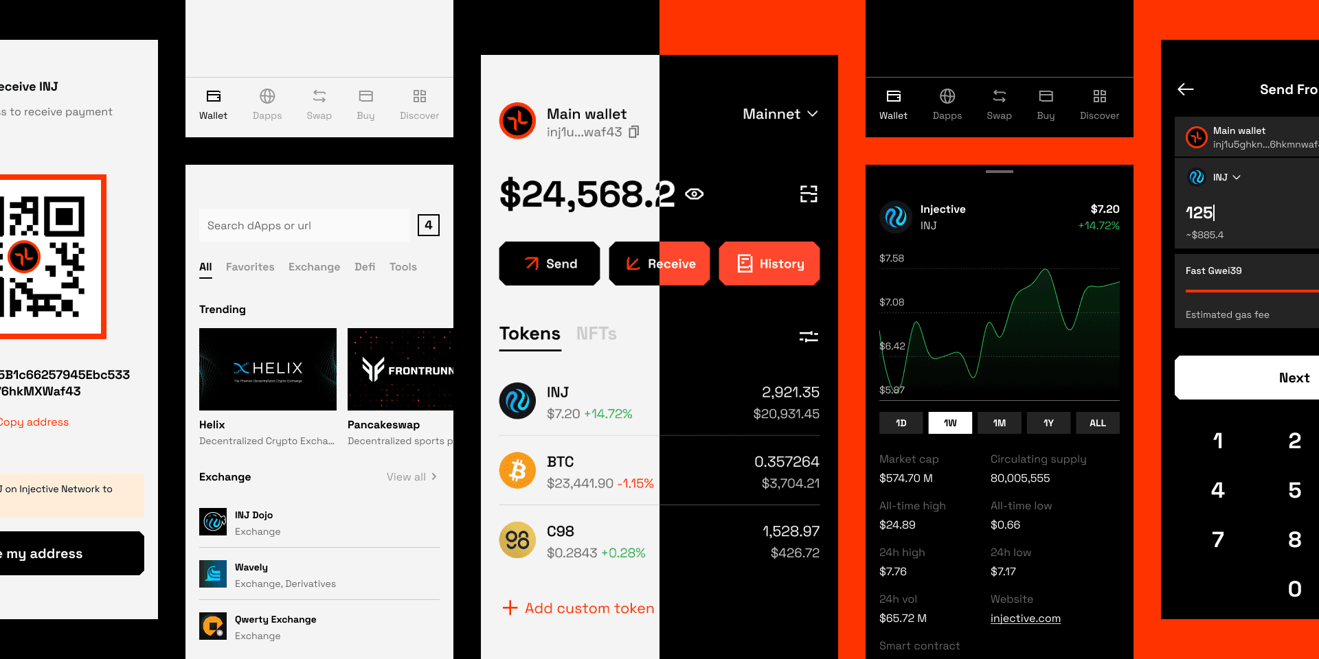
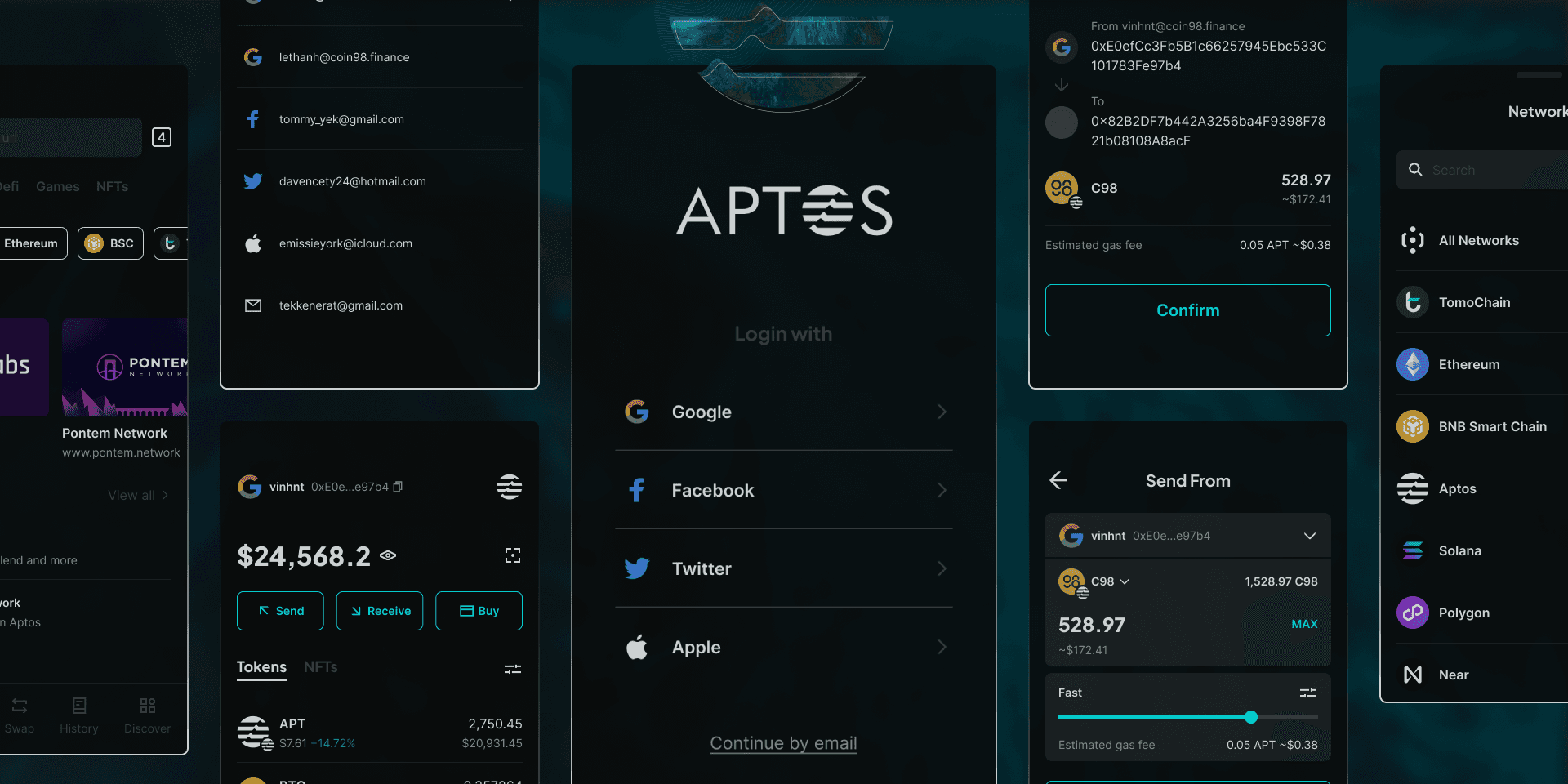
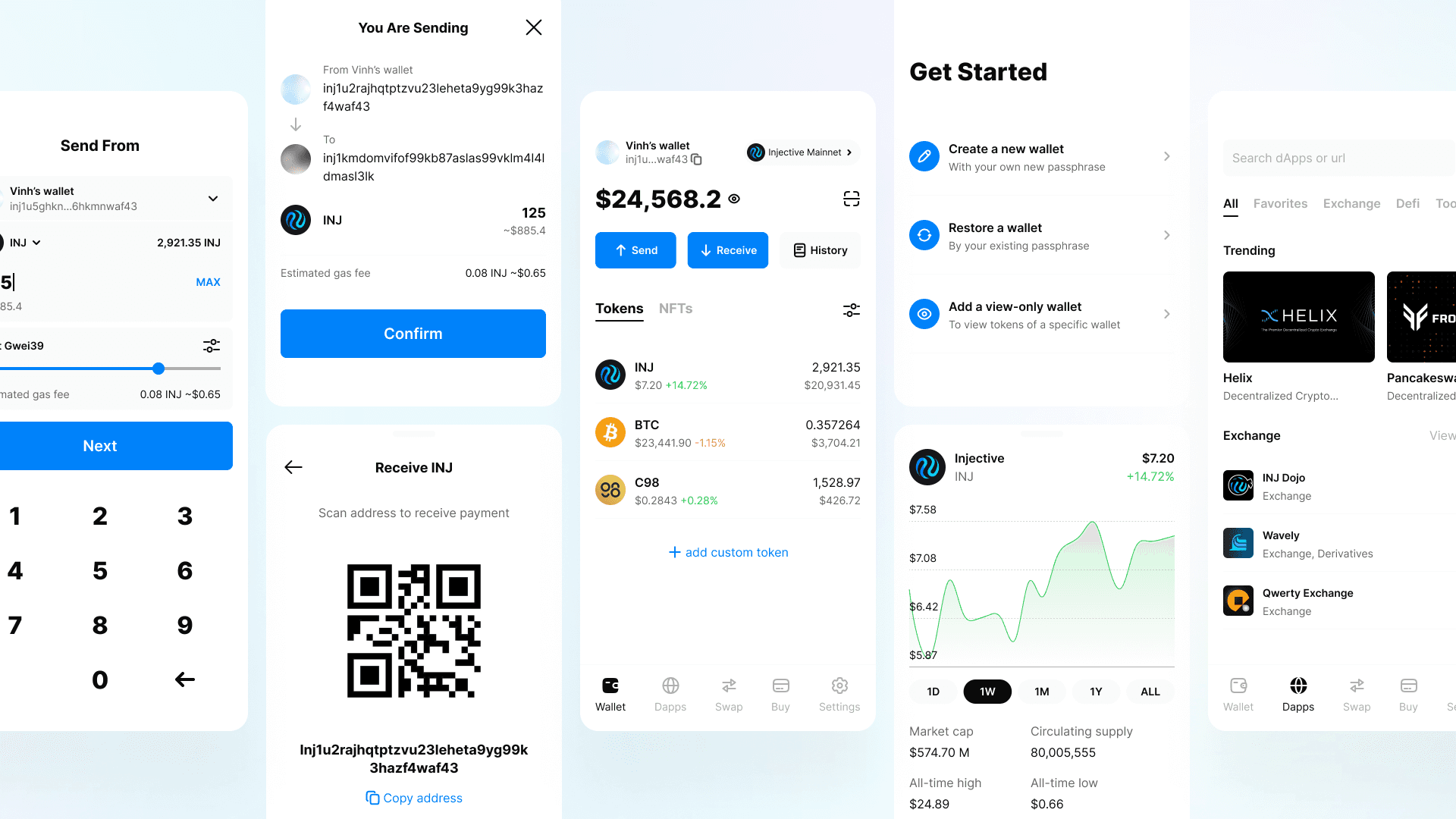
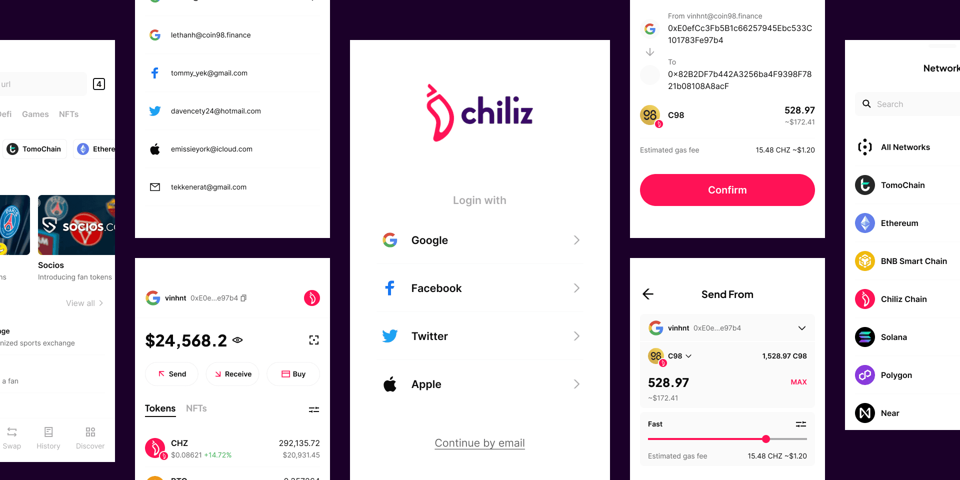
Blockchain is expanding rapidly, and decentralized wallets are emerging across new networks faster than design teams can keep up. At Ninety Eight, I was assigned to oversee the entire single-chain wallet segment — an ecosystem of multiple independent wallets, each on a different blockchain. To meet this pace, I researched and built a flexible UI config system that adapts to different platforms while keeping everything visually consistent.
Each new blockchain wallet had its own brand identity, platform targets (mobile, browser extension, desktop), and content variations. Without a shared system, every wallet meant starting from scratch — duplicating tokens, rebuilding components, and manually adjusting specifications across environments.
Product development moved fast. Design needed a way to keep pace — not by working harder, but by working from a foundation that could flex across any wallet without losing consistency.
The initial experiment was to create a foundational UI framework — one reusable core that could underpin any crypto wallet project. I called it Global.
Established a core set of color tokens, number tokens, base components, and a structural framework that any wallet could inherit as its foundation.
Introduced a supplementary layer of brand-specific tokens, styled components, icon sets, and typography — sitting on top of Global like a customizable skin over a shared structure.
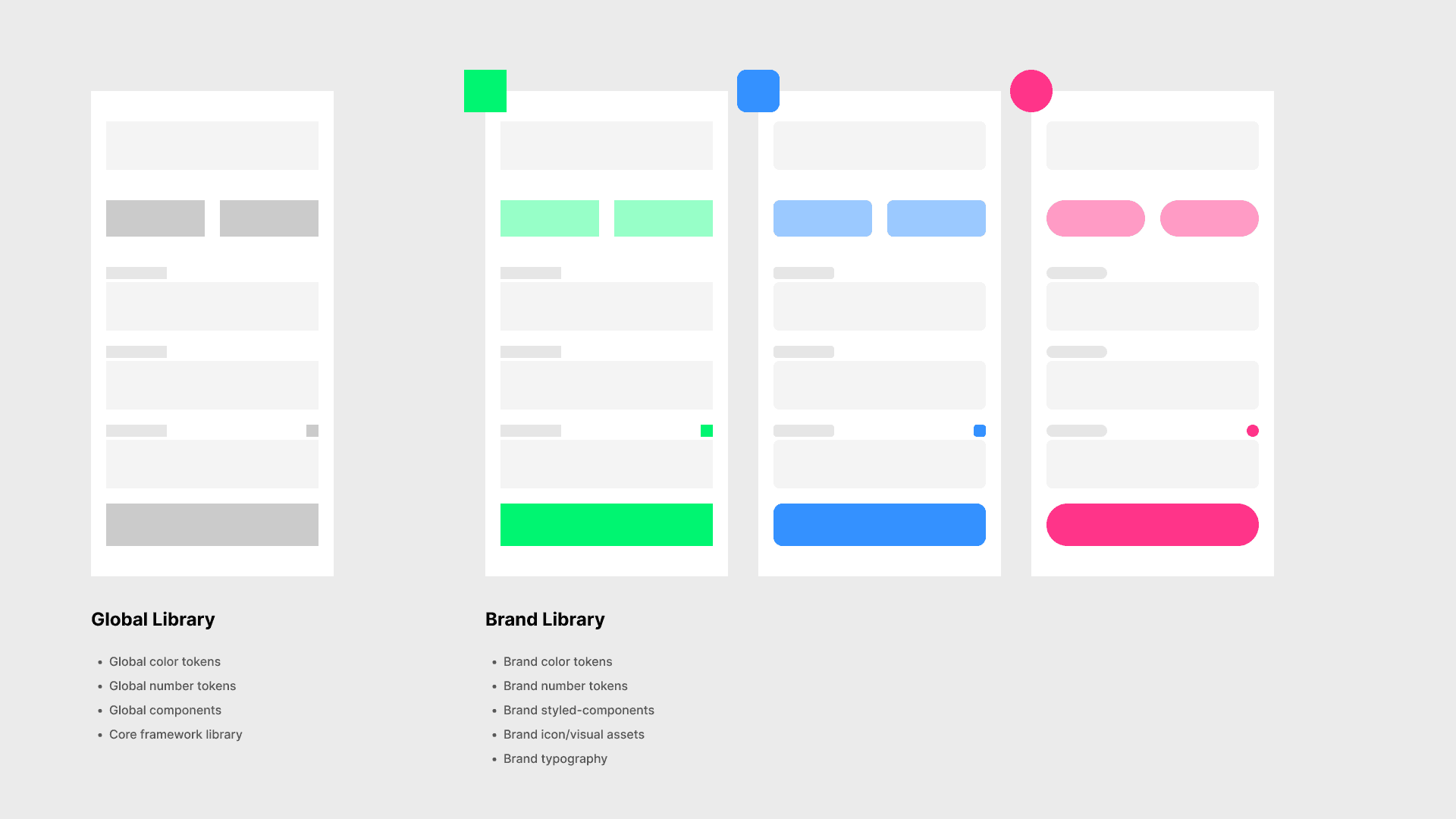
The system was structured into three layers: a Global foundation, a Brand overlay, and a Config layer for fine-grained control across platforms and content environments.
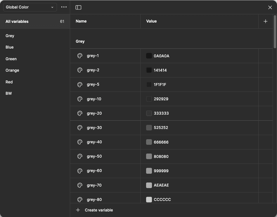
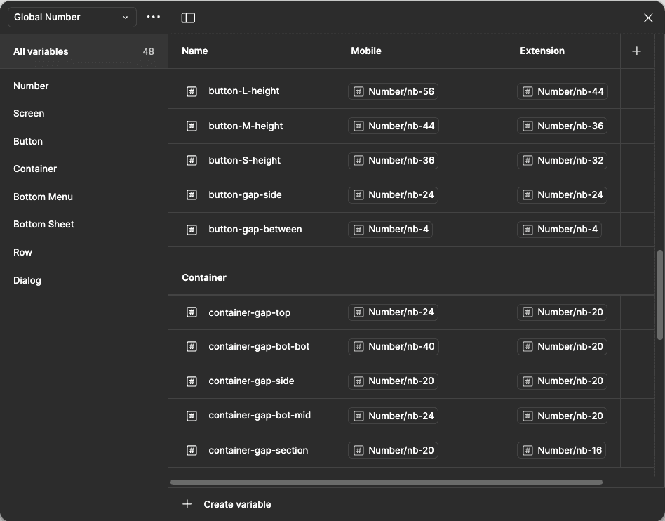
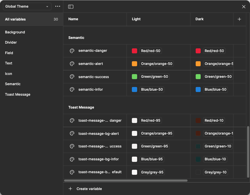
The core foundation shared across every wallet. Global Color defines the base palette and consistency anchors. Global Number establishes sizing, spacing, and border-radius parameters. Global Theme sets the dominant color character that brand tokens build on.
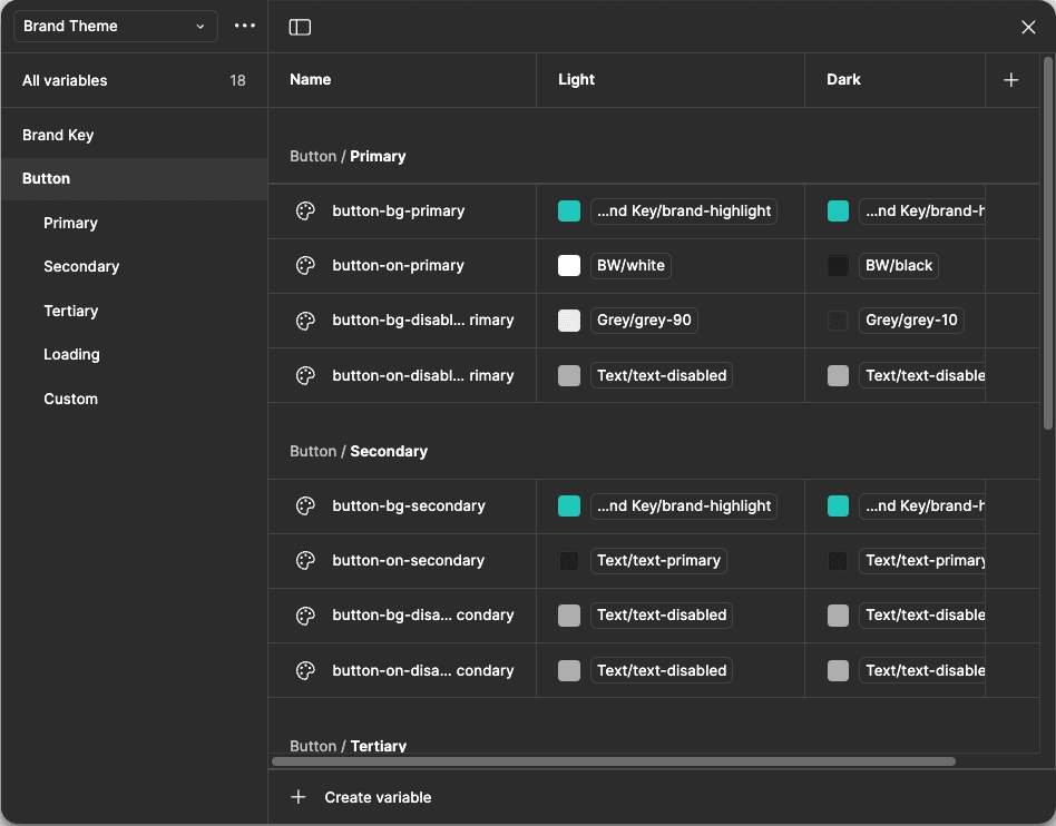
The visual skin applied over the Global structure. Brand Compo provides skeletal variables for screen size, containers, and lists. Brand Content centralises all brand-specific copy and assets. Brand Theme applies the final visual identity — each wallet gets its own theme without touching shared components.
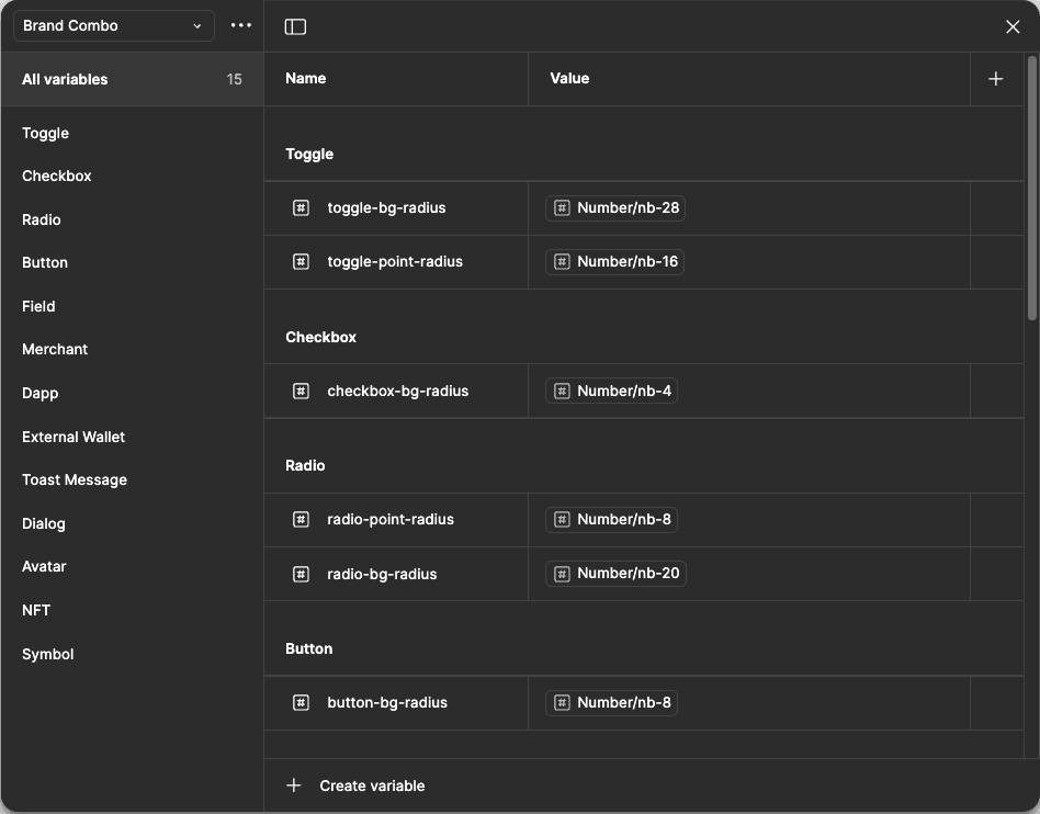
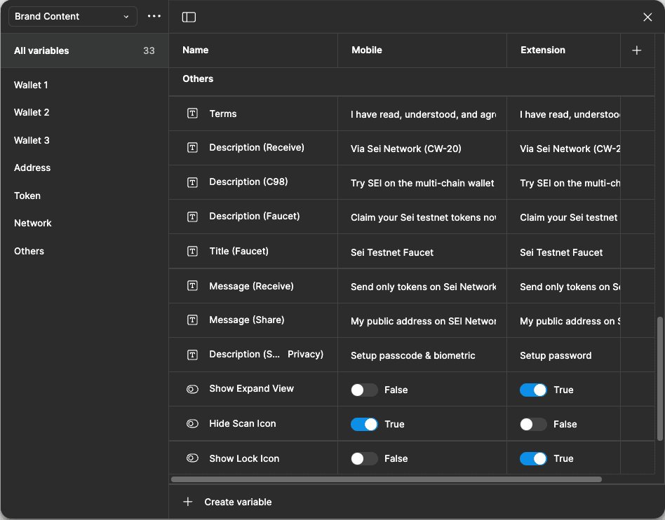
Four controls handle cross-environment adaptation. Platform Config adjusts screen sizes, spacing, and feature visibility per environment (mobile vs. browser extension). Content Config swaps copy and labels based on platform support — e.g. "Setup passcode & biometric" on mobile, "Setup password" in browser extension. Brand Config fine-tunes border radius and style overrides per wallet. Component Control manages visibility toggles and synchronisation across core elements from a single place.
It took two weeks to finalize and stress-test the system structure. The impact was immediate — developers building the code library in parallel could reuse design elements directly, reducing duplication on both sides of the team.
Reduction in total design time for each subsequent wallet built on the system.
New wallets shipped using the config system, each with a distinct brand identity.
Time to finalize and validate the full system structure before production rollout.
Product Design | User Experience Design
I adore solving problems and designing digital products.